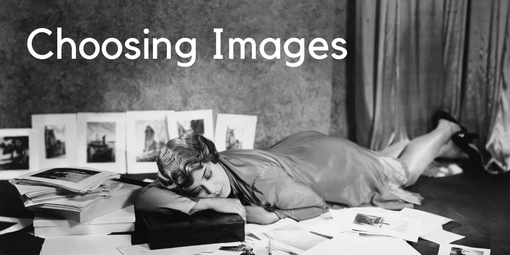
Choosing Images for your Social Media
Choosing Images for Social Media
Social media is a hungry beast and one of the many things I frequently have to explain to clients is the importance of images to their brand and their social feeds. And also that like teaspoons, you’ll always need far, far more than you’d think.
Curating and combining images is something I love doing. Producing surprising combinations and playing around with layouts always helps capture the essence of a client’s brief. I have my own distinct style for my own feeds, but as with capturing a client’s tone in captions, it’s vital to match that in a corresponding visual language.
We all know the saying ‘A picture paints a thousand words’, but did you know that our brains register and process images in as little as 13 milliseconds — just over 1/100th of a second? In fact one study estimate suggests that visuals communicate information 60,000 times faster than text. So taking the time to think about the images you use and establishing your brand’s visual tone is vital.
If you have worked with a designer or branding consultant, you should already have your brand colours, fonts and crucially your logo. So where to start with images? I promise you it doesn’t have to be overwhelming if you start with the basics.
In addition to developing your own visual style, every business needs a suite of assets they can dip into and mix and match. An asset being any kind of content but in this instance I’m talking about visuals – photographs, videos, graphics, illustrations, infographics etc. These will be added to over time and just like your fashion ward-robe basics, there are some definite Must-haves:
Portraits
Whether you’re a solopreneur or you have a large team, it’s important to have up-to-date photos to share online. It’s your new shopfront after all! Ideally I would recommend you invest in some professionally shot images* as the quality stands out a mile.
[*The benefits of working with a professional photographer are that you will end up with a set of consistent, quality images that will stand the test of time. While much rests in the detail you have included in your original photographer’s brief, this is a very worthwhile business investment and it pays to look around and find a photographer who’s portfolio you like and can imagine working with. It doesn’t have to cost the earth and often local photographers offer branding shoot packages. Find one who you know will get your business and help you demonstrate your expertise but with a relatable human touch.]
Action shots
By this I mean relevant photographs showing you doing what you do. Ie; If you’re a maker, shots of you in your workspace or studio at work. If you’re a mechanic the same applies. NB: These kinds of images can sometimes appear a bit staged which is why it is important to make sure you are working with a photographer you have rapport with so they can keep it natural.
Clear Space shots
These are combinations of the above Portrait/Action shots with enough empty or less detailed space around the main area of focus so that you can overlay text or your logo for example. Having a bank of shots like these in your toolkit ensures visual consistency and provides much needed flexibility when it comes to choosing images for your social feeds. There’s nothing worse in my mind than rows and streams of the same formatted images, like an avalanche of blandness. I think it’s important to break up your feed now and then with something just a little bit different to stop the scroll and catch viewers interest. Ensuring you have a series of wide framed shots affords you the option of zooming in on specific sections or details to add interest, overlay a logo or even a quote.
There are of course techniques you can use in Canva for example – removing backgrounds etc, but ensuring you have a selection clear space shots in your arsenal affords you much needed flexibility as needed.
Your Visual Style
This is what sets you out from the crowd. It can be bold, it can be subtle, but always works best when it’s rooted in what you do and what you instinctively relate to. Trying to replicate someone else’s look and feel won’t necessarily suit you or resonate with your customers ,which is why it’s important that you take the time to develop your own visual style. Take a look at your past posts, what particular images have stood out and gathered the most engagement? If they are in-action people shots, then find a way to incorporate more of them. You don’t have to re-invent the wheel. This is about identifying your style and keeping it as simple as possible.
For myself and clients I use a three words technique. From initial consultation and user persona creation to help define their ideal client, I like to distill this valuable information into three words – for example, my three words are; Creative, Curious and Eclectic. [Not to be confused with the brilliant app What3Words which if you don’t have it on your phone I recommend you download asap – but similar in that instead of pinpointing your exact location to within feet, they do narrow down the essence of your mission and values.]
Having these words in mind when I start creating client images always helps me stay on track in producing visual assets that are unique and true to their business’s character and mission.
Other image sources
In addition to using my own images, I rely heavily on stock photographs. No need to groan, everyone does it, but a golden rule I always recommend is cropping them so as to enable you to add your own distinct visual style and avoid the ‘if-I-see-that-image-once-more-I’ll-scream” response. Remember you’re going for authentic – you want the images you use to reflect you and your business, not a bunch of awkward mannequins. Whatever you share on your feeds or in your ads should always look like it comes from you, could be you.
My go-to royalty free stock photography sources are; Canva, Pexels and Unsplash. There are many others, but many you will have to pay for. Remember to always be sure of the image usage rights.
My Process:
My image choosing process is roughly this;
- Consider my target audience – what do they want/need to know, discover, want to avoid etc
- Content ideas – my ways of answering and addressing the above points
- My three words – words that define my business: Mentioned above.
- Research – an ongoing task as often I see images or quotes etc and simply save them for future reference. If I see things that fit my visual style and tick at least one of my three words they might match an idea I’ve already had or inspire something new. In addition to seeking inspiration – it’s important to note that I am also looking for visual consistency. So even though I may be using images from a variety of sources, the kind of lighting or filters used etc should remain similar.
- Create – start pulling ideas and materials together. Rather than relying on standard templates, either for myself or clients I like to make things distinct. This may mean tweaking an existing Canva template for example or creating something entirely new that incorporates their brand colours and is something they can re-use.
- Test it – Vital part of the process. Sometimes you’re going to love what you have created but your audience doesn’t. Maybe it’s just timing or maybe it needs more work. Test it and remember your ultimate goal is to appeal to your audience, not your vanity.
Ultimately the images you choose and the layouts and formats you apply to your grids and feeds are an expression of your visual identity. Getting that right makes presenting your content all the easier and helps your audience identify you instantly as they scroll on their phones.
Want to talk more about developing your own visual style? Get in touch for a free 15 minute discovery call or a 60 minute Content Brainstorm session. I know we’ll find lots to work with.
Extras:
Here are a few helpful visual style snarfs (sneaky short-cuts) to keep in mind;
Your Logo:
.eps files are for print – .png and .jpeg files are for digital use.
You’re (probably) not always going to display your logo against a white background, so having it available in simple white and black versions and crucially transparency versions is so useful. A white transparency version looks great layered over coloured images for example.
Props:
Try incorporating a couple of props in your brand colours in the background of your photographs. Or if you can, paint a section of wall with your main brand colour and keep it clear of posters etc for use as a go-to backdrop. It’s a subtle way of maintaining consistency in your branding.
Image size:
It matters people. Whether for formatting or clarity, it’s vital to remember that the higher quality (pixels) the larger the file size. Always better to start with a higher quality image than the other way round – and crucially, to get the most out of your visuals you want to ensure the images you use are clear, sharp and specifically formatted for whichever social platforms you’re using.
Text overlays:
A great tool, but do go easy. Too much text is a turn-off. Be succinct or use it to inspire curiosity and encourage them to read on. Less is definitely more in this instance.
Visual diary:
A lifelong habit developed in art college, I keep several of these on the go. Either in digital format or in notebooks, whatever works for you. Keeping a note of ideas and images that spark some inspiration is a handy way to develop concepts and give you something to dip into if you feel your content is looking a little stale.
Category: Blog